
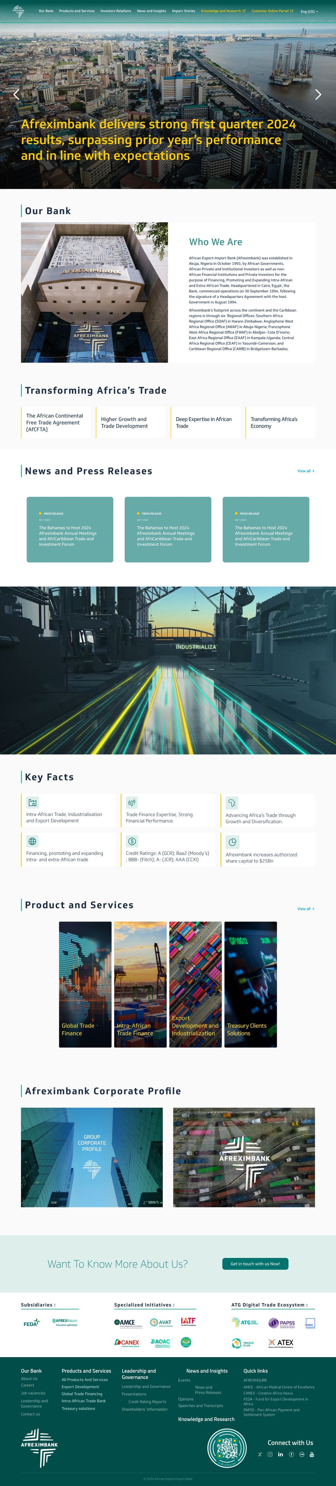
Redesign of the Afreximbank portal: 300+ pages, one logic
UX audit, new architecture, design system and development: STEPS rethought the entire digital presence of the Pan-African export-import bank, for stakeholders in more than 50 countries.

A portal that no longer reflected the institution
The UX audit of the 300+ existing pages revealed four problems. Each one got a precise answer.
Each section had its own visual logic.
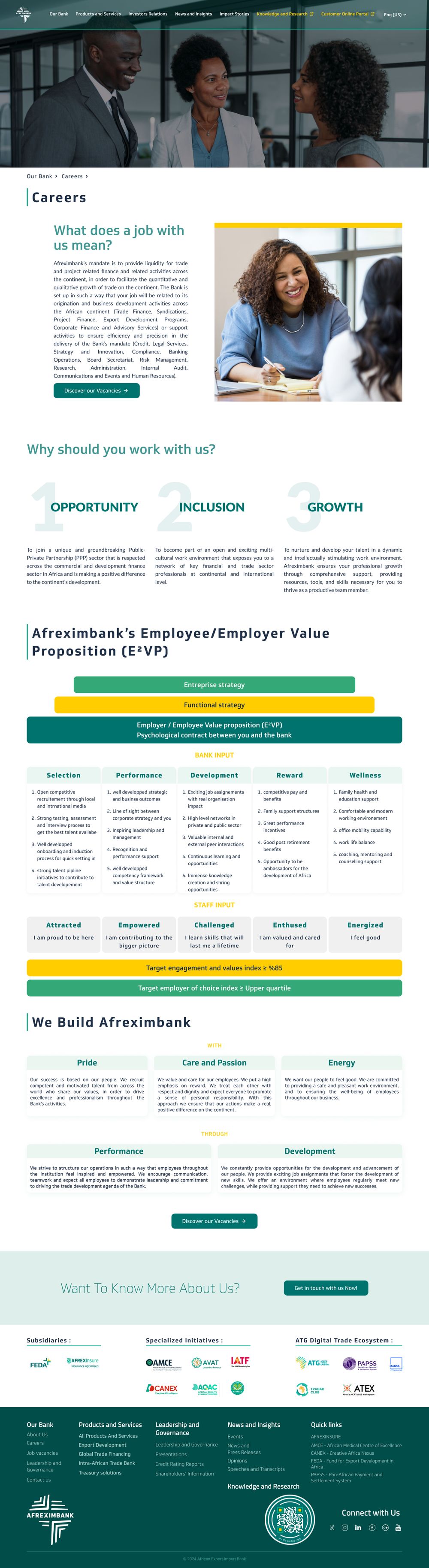
More than 20 reusable templates, shared components.
A confusing hierarchy across more than 300 pages.
A mega-navigation that leads to the right content in two clicks.
An image out of step with a rated institution.
Strong photos, assertive typography, the brand's green and gold.
Products filed by department, not by need.
Find a financing solution based on your need, not on the org chart.
Six sections, one mega-navigation
We reorganised more than 300 pages into six main entry points. Click the menu to browse them.
Our bank
Institutional identity, governance and investor relations.
- About and key figures
- Vision, mission and strategy
- Credit ratings
- Investor relations
Products and services
The catalogue of financial solutions, with visual navigation.
- Grid by category
- Detailed product pages
- Trade finance
- Treasury and advisory
Media and events
An events platform with registration and speakers.
- Upcoming and past events
- Speaker profiles
- Countdowns
- Navigation by year
Impact stories
Video stories about Africa's transformation.
- Campaign banners
- Video cards
- Editorial grid
- Content by season
Knowledge and research
A library of publications and reports.
- Research library
- Downloadable reports
- Navigation by category
- Search and filters
Contact and careers
Regional offices and job openings.
- Forms with routing
- Office locator
- Job openings
- Multilingual support
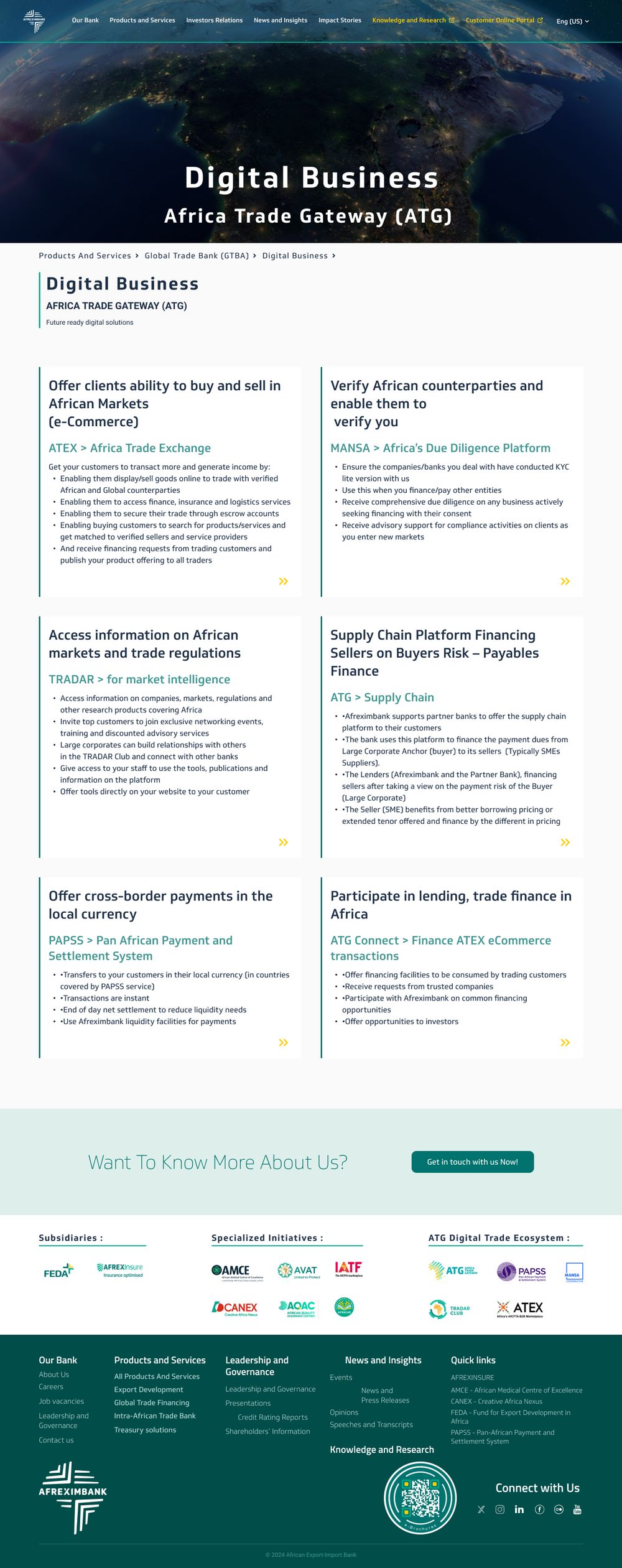
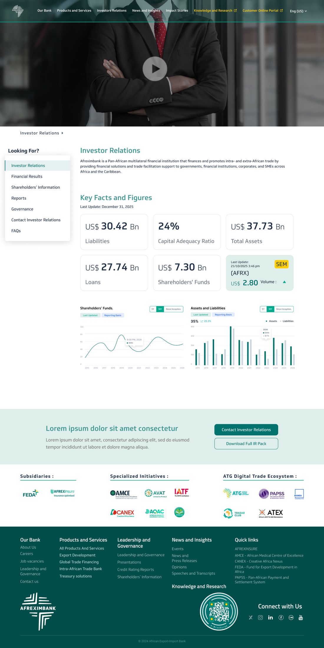
20+ templates, one family
Each content type has its own template, built from the same components. Hover over a screen to browse it.
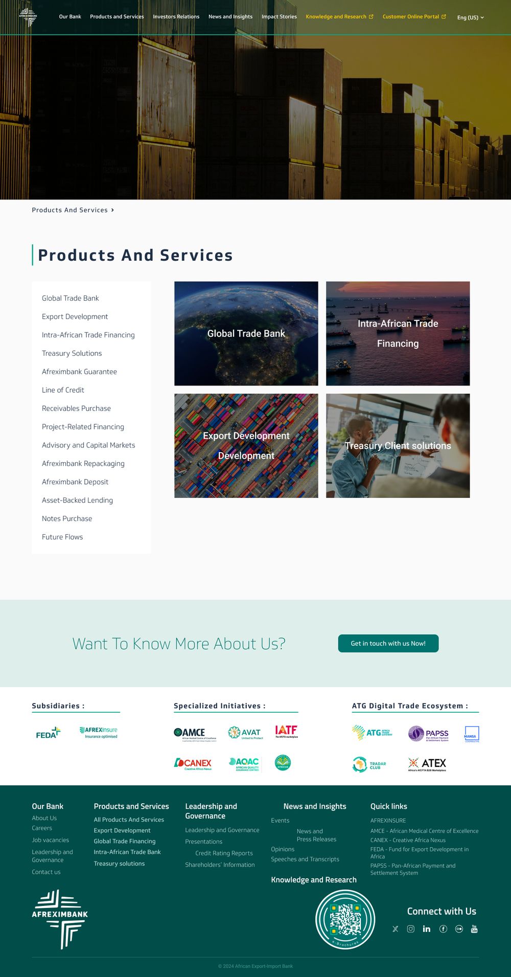



Finding a solution in a few clicks
The redesign of the Products and services section, annotated.
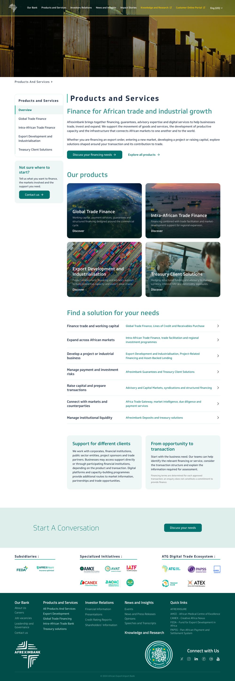
- A fixed sub-navigation
The section stays visible on the left: you always know where you are.
- Solutions presented as cards
Each product family has its own card, image and link.
- An intro that frames the section
A heading and a sentence say who the section is for, before going into detail.
- Contact always within reach
In the left column, a box points to the right team when visitors don't know where to start.
From audit to launch
A dedicated team of 10 people, four phases, zero service interruption.
Navigation, content inventory, user journeys and pain points across the 300+ pages.
Information architecture, wireframes, high-fidelity mockups and design system.
WordPress and Elementor, custom plugins, responsive, performance and content migration.
Cross-browser testing, accessibility, SEO migration, go-live with no interruption.
"STEPS transformed our digital presence into a platform that truly reflects the scale and credibility of our institution."Digital team, Afreximbank
Frequently asked questions
How do you rebuild 300 pages without breaking everything?
By starting with an audit and a new architecture, then building reusable templates. Content is migrated page by page, with SEO redirects.
Does the portal stay online during the redesign?
Yes. The rollout is gradual, with no service interruption for visitors.
Can the bank's teams publish on their own?
Yes. The WordPress and Elementor templates let teams publish news, events and reports without a developer.
Your institutional portal no longer reflects your organisation? Let's start with an audit.
Book a scoping session ↗