
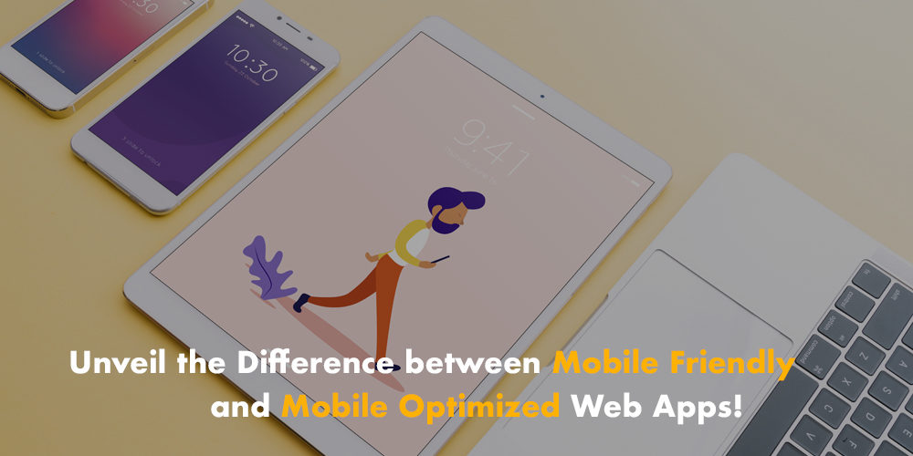

You certainly have heard of mobile-friendly and mobile-optimized web app. But do you really know the difference between these two terms? Following the mobile revolution, many businesses have set one priority: making their websites mobile-ready. Added to this, many web developers have adopted a responsive design to grant users an enjoyable mobile trip. In fact, you should have a website that displays with a high resolution through a variety of formats. Steps’ developers work hard to ensure this goal. And grant their clients the best user experience. But first, let’s grasp the meaning of these newly coined words.
1/ What’s a Mobile-Friendly Website?
Mobile friendly refers to a site that displays accurately between your desktop/laptop computer and a mobile device. Such as phones and tablets. Thus, we will need a minimum of scrolling and image sizing. Regardless of the device, you are using, our mobile developers make sure that your app functions in the right way. In fact, the percentage of mobile users is increasing at such a terrific pace. You need to have a mobile-friendly app to guarantee that users come back to it. Our skilled web designers adopt small image sizes. And that to allow for fast loading over mobile connections.
When we talk about mobile-friendly websites, we take into consideration several features such as
-
Text-based pages
-
Slideshows
-
Image sizes
-
Buttons
Now, let’s figure out what differs mobile-friendly websites from the mobile-optimized website.
2/ Any Idea about Mobile Optimized Website?
We will talk about mobile-optimized sites which are way more complex websites. Web developers will ensure that the site will reformat itself for a list of handheld or tablet devices. The coding of the site will allow it to adjust itself to any device. It is no longer a matter of image sizing or functional buttons. In fact, many users are hooked on their smartphones looking for new products. When they encounter websites that are not mobile optimized, users get annoyed. They won’t be tempted to get back to your site. Unfortunately, this will give us a negative bounce rate.
To avoid this embarrassing situation, your website should be optimized in terms of coding and web design to grant a great user experience for clients. In fact, our developers will build a website that allows the user to easily navigate and engage from the small screens of their handheld devices. This will help them reach their buying decision faster. The first features to look for:
-
Fewer touch points in a minimal design
-
Less typing unless necessary information
The third term to look for is the commonly used “responsive design”. Let’s grasp it together:
3/ What’s your Definition of Responsive Design?
Web design is witnessing a remarkable revolution. The old notions are toppled to pave the way to new forms and optimized templates. We are merging towards a user-focused web design. The client should feel like a king or a queen once he lands on your web page. This is will be the case if you opt for a responsive design. We will develop for you a site that is utterly flexible regardless of the device used. Forget about the browser of the device used, the website adjusts itself to the size of the screen. Thus, the site is reformatted and optimized to ensure great flexibility for users. Although it has higher development costs, a responsive design is a necessary element to attract users and make sure they come back to your site.